Diversity Works app
Project duration: 10. 2023- 11. 2024.
Client: Competence Center of Diversity and Inclusion, University of Saint Gallen, Switzerland
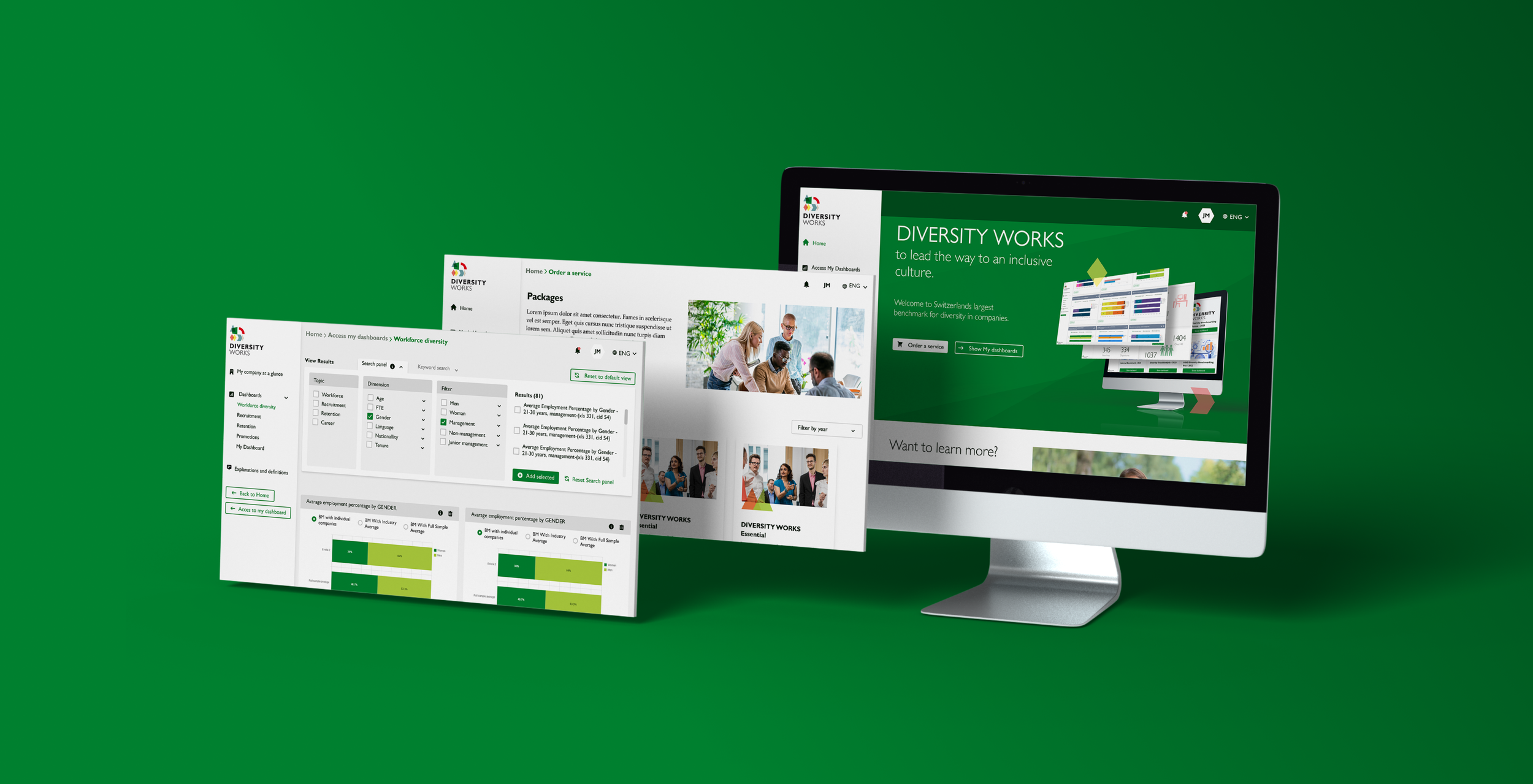
The Diversity Works app is an interface created by the CCDI (Competence Centre of Diversity and Inclusion) operating at the University of Saint Gallen, which essentially provides data analysis, consulting, and contact functions in the field of company workforce diversity and inclusion.
As a junior UI/UX designer I was responsible for rethinking and unifing the designs of several features of the app (including user dashboards, forms, search functions, admin interfaces, product displays, and informational materials) in consideration of the original brand identity and the client’s needs. I also designed new features such as dashboard for user engagement analytics. I transferred the desktop screen designs to mobile screens as well. Furthermore, I conducted user testing. During the project I regularly contacted with the developer team and the clients in person and via video meetings. I created the designs in Figma.
I joined at the beginning of the project, when the image of the product was still being formed. My primary challenge was to reduce the existing design elements focusing on simplicity to establish a clear direction and create a cohesive brand identity.
This task included:
-reducing buttons for primary secondary and tertiary buttons.
-reducing the product icons for one icon family.
-reducing the product colour palette
-reducing fonts for two font families. (One for titles, one for body text.)
-defining unified look of pop-up boxes.
-defining unified corner radiuses of every field, card and object.
-defining unified margins and paddings.
Besides these
-I changed the background colour for one that suits more the brand colour palette.
-I changed the primary font colour from pure black to dark green to make it more convenient for vision.
After implementing those changes the general look and feel of the product has developed significantly.
Design Guideline update
Following the updated design guides I redesigned many features and functions of the app such as the home page, user dashboards, forms, search functions, admin interfaces, product displays, informational materials and more.
During the design process I considered the latest UI/UX best practices such as
-clean layouts by mainly using cards
-proper application of colour contrast
-proper application of hierarchy
-proper application of spacing
-proper implementation of UI design elements like icons, buttons, images/videos, charts, input fields, dropdowns, checkboxes, radio buttons, progress bars, and more.
Redesign

During the development process new demands were formulated by the client, leading us to implement additional features, such as an interface for tracking user engagement. This task involved designing effective data visualization solutions.While the client could specify what data they wanted to see, they were often uncertain about how to best visualize it —particularly for aspects like distribution and ratios. After conducting research and consulting with the development team, we identified appropriate open-source charting tools to meet the client’s needs. In other cases, we created custom charts to ensure the visualizations aligned with their specific requirements.
New features
The next phase of the project was to create mobile versions for the screens
During the design process I applied the recommended UI/UX practices for mobile screens such as
-using one vertical column alignment
-optimising the UI for touch interactions by increasing the sizes of touch targets and space between design elements
-giving recommendations the client about prioritiznig and reducing content.
Mobile views

I had the opportunity to conduct user testing on the landing page of the Diversity Works app.
The main goal of the testing was to investigate how difficult it is for the users to find information about particular services and products on the website.
For the testing I hired 5 volunteers, and conducted a 60 minutes/participant moderated usability study that was recorder by screen recorder.
I analysed and synthesised the results by creating affinity diagram.
The research results supported our hypotheses, demonstrating that users in some cases face difficulties in easily locating information about certain products and services. These findings will be valuable for guiding the further development of the interface.
User Research

During the design process I regularly contacted and cooperated my project manager, the contact person from the client side and the developer team via Slack, video meetings and in person. Since the stakeholders were an international team, the working language was English. Despite the fact that we worked mostly remotely, we were still able to work together smoothly and finally create a stunning app.
Cooperation
“I am the product owner for the application on which Dora supported us in the UI/UX design. I work remotely with the dev team of which Dora was part of. Dora joined the team after the project was started. I found that she quickly adapted and learned about the project. She was curious and asked questions. She always came back with suggestions and good ideas.I found communicating with Dora very easy. She always replied promptly and provided clear timelines for task completion. She always delivered as promised. I enjoyed working with Dora and I think she would be a good addition to any team that supports curiosity and innovation.”
Meenu Bhargava
product owner