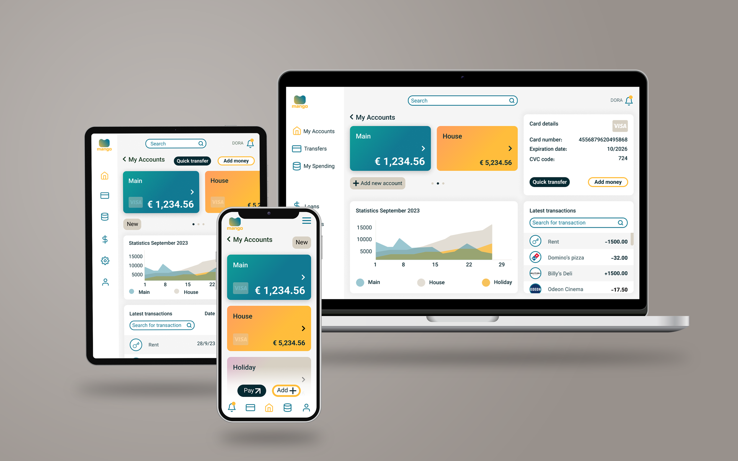
MANGO Banking app
MANGO app design was created as the final assigment of the UI design course I have attended. I had to consider keywords like playful, clear and trustworthy during the design process. The design had to be responsive so I made desktop, tablet and smartphone view as well. I made several iterations before the final design and worked a lot on finding the best fit for the colour palette. I think MANGO managed to be a friendly, easy platform to arrange online finances. I used Figma for the project.


I have given the brand name Mango to represent the freshness and liveliness of my banking app. Deep yellow and green colour shades refer to the fruit itself and the shape of the logo models an “M” letter. Mango has an alternative interpretation “Man go!” that I find dinamic and playful.
Logo


Colour palette

Typography


Icons


During the design process I made several iterations end experiments to find the best design solutions. The first version was too intense so I tried to refine the use of colour and the colour combinations. I applied the feedback of the course mentors succesfully.
